Erva do VEio — Brand IDentity & Packaging
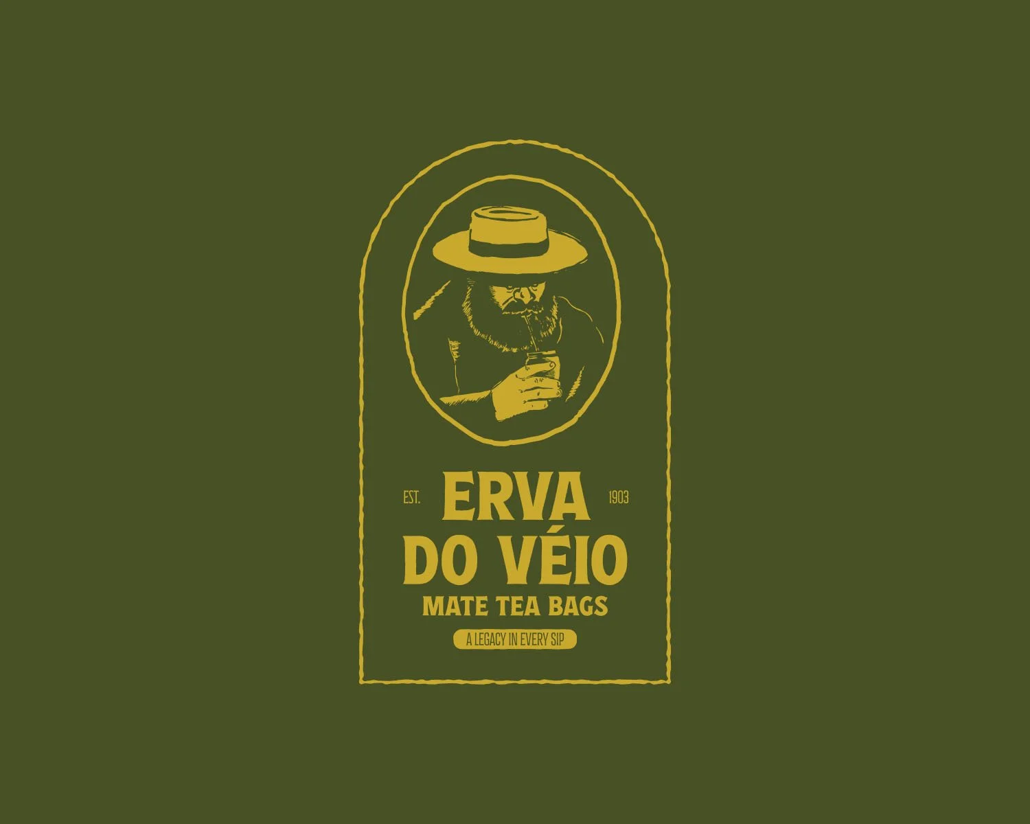
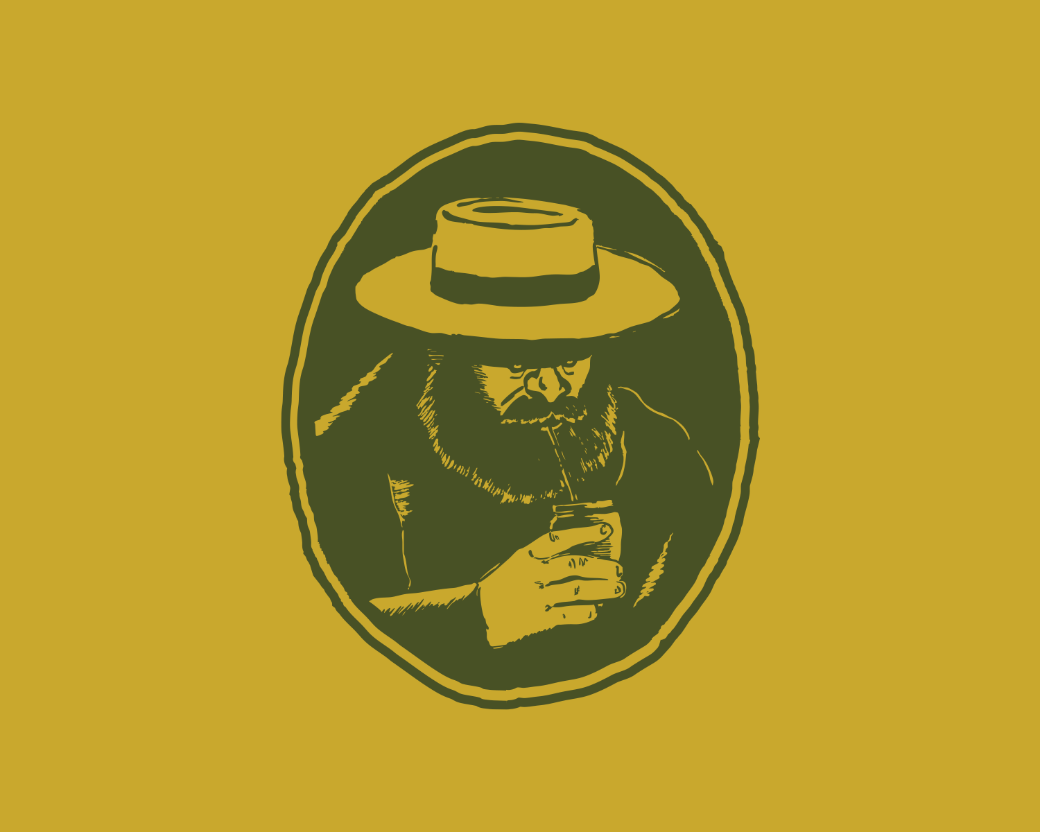
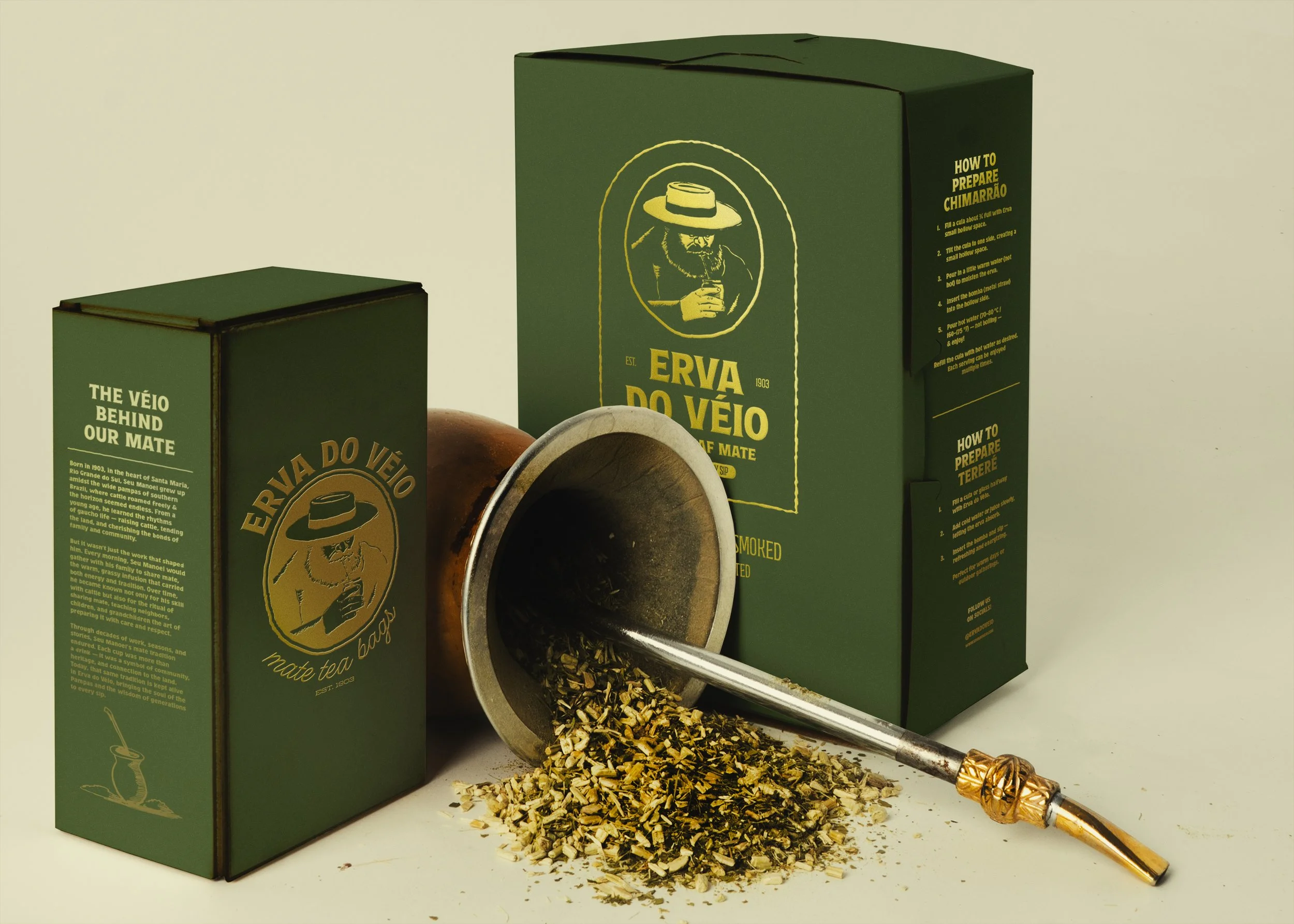
Erva do Véio” is a conceptual Southern Brazilian chimarrão (mate) brand created for the American market, built around the heritage and storytelling traditions of the region. At the center of the identity is Manoel, a gaucho whose likeness symbolizes the wisdom, resilience, and ritual of generations who have prepared mate before him. His hand-drawn portrait gives the brand a personal, almost ancestral presence, grounding the product in lived culture rather than abstraction. The muted greens and yellows draw from both the natural hues of mate leaves and Brazil’s national colors, intentionally softened to evoke age, authenticity, and a sense of legacy. Bold, rustic typography, textured lines, and classic emblem framing further reinforce a familiar, time-worn feel. Together, these elements create packaging that feels artisanal yet approachable, inviting American consumers into the tradition of chimarrão through a visual story that honors Manoel, the gaucho behind the brand’s soul.